



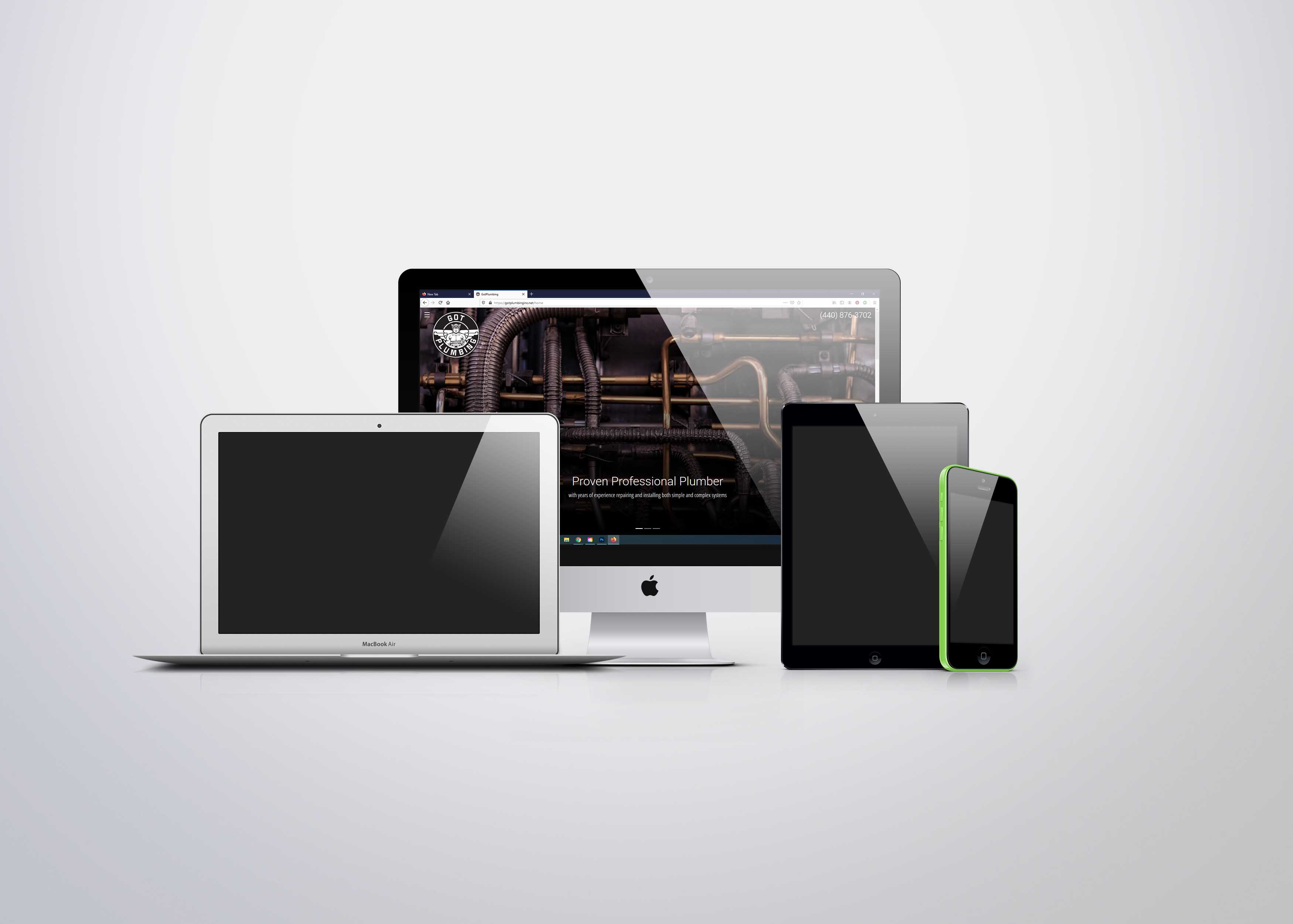


(Freelance) Got Plumbing Inc. is a local plumbing company based in the greater Cleveland area. They repair and install plumbing applications in Parma, Cleveland, and the surrounding areas.
The web designer was in the process of designing a website for the company but did not have a background in graphic design and was unable to properly design a logo. I agreed to take on the job of logo designer. The client had a clear vision of what they wanted their logo to look like. They wanted a Cleveland Guardian holding a plumber’s wrench with a circular background. I was tasked with taking their concept and turning it into a final logo design.
I worked closely with the client and web designer to turn the client’s desired logo into a reality. Initially I started with sketches to be reviewed by the client.I changed the logo to fit the client’s idea of what it was they wanted. I delivered print and digital logo files to the client to be used for commercial purposes.
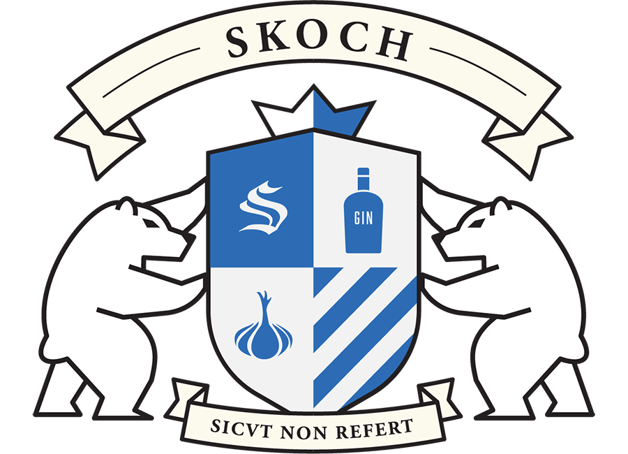
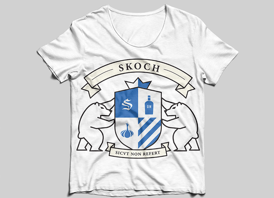
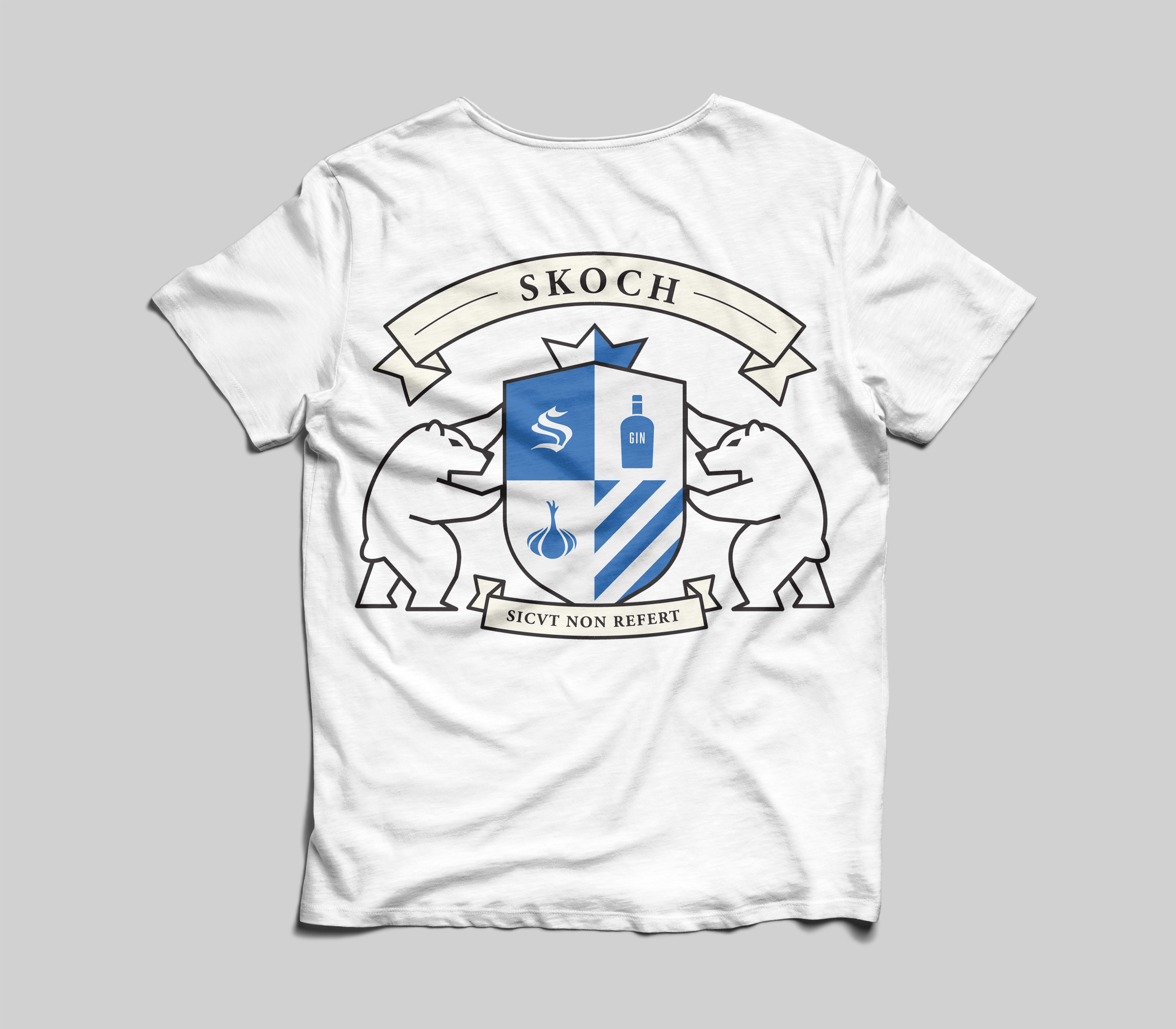
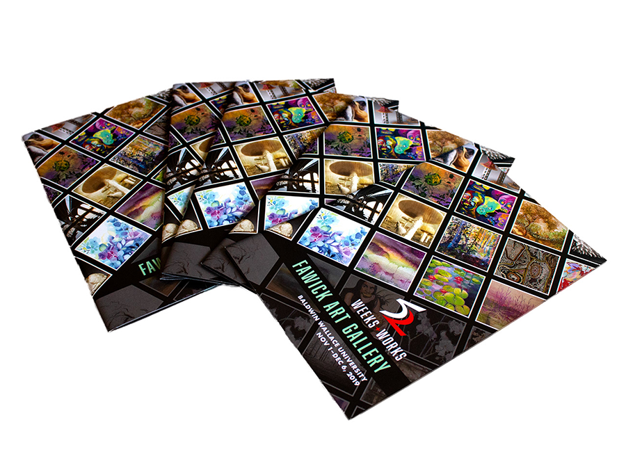

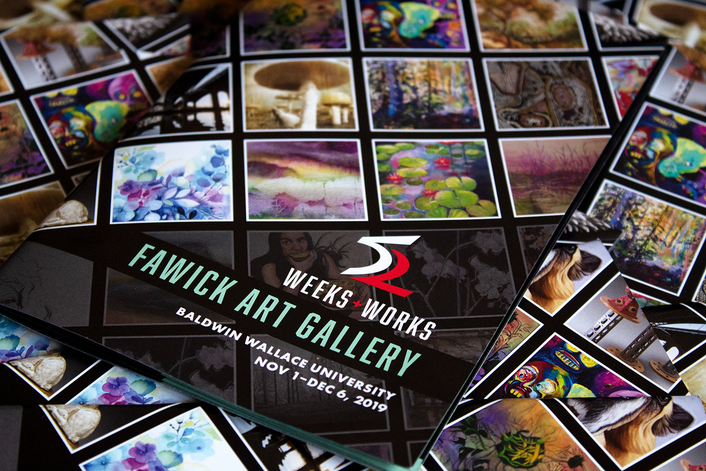
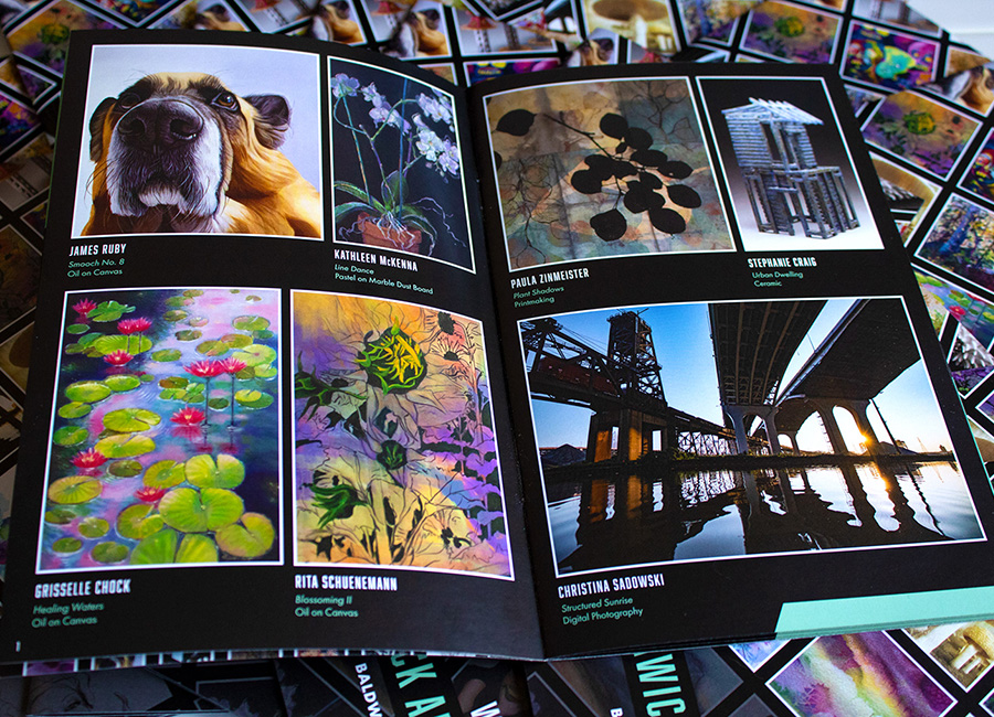
(Independent Study) AGC The Creative Advantage and Baldwin Wallace University partner together each fall to host the“52 Weeks 52 Works” art showcase. AGC designs and prints the “52 Weeks 52 Works” calendar every year. AGC collects artwork from local artists in the greater Cleveland area to be printed as calendar art. Baldwin Wallace displays the original artwork from the artists in Fawick Gallery and invites the artists, family, and friends to visit on opening night.
For this project, I was tasked with designing the logo, brochure, and social media graphics from concept to completion. The brochure and assets were to be completed before a deadline so that they would be ready to be handed out during the show. Last-minute edits to the brochure text, images, and artists’ information had to be made before the brochure was prepared for print production. After designing the logo and brochure, I had to make sure they were ready for print production. Social media graphics needed to be made as well in the correct size and format.
I began working on thumbnail sketches to propose design concepts to the art faculty and staff for approval. All of my work began with pencil and paper sketches, then moved to digital media once the sketches were reviewed and approved. I used Illustrator to design the finished logo. InDesign was used to create, edit, and organize the brochure pages as well as make sure the artwork had the correct artist attribution. I added an alphabetical index page for usability. The index page allowed readers to look up the page of the artist or work they were interested in. My knowledge of typography helped me to correctly use, organize, and pair the text in the brochure.

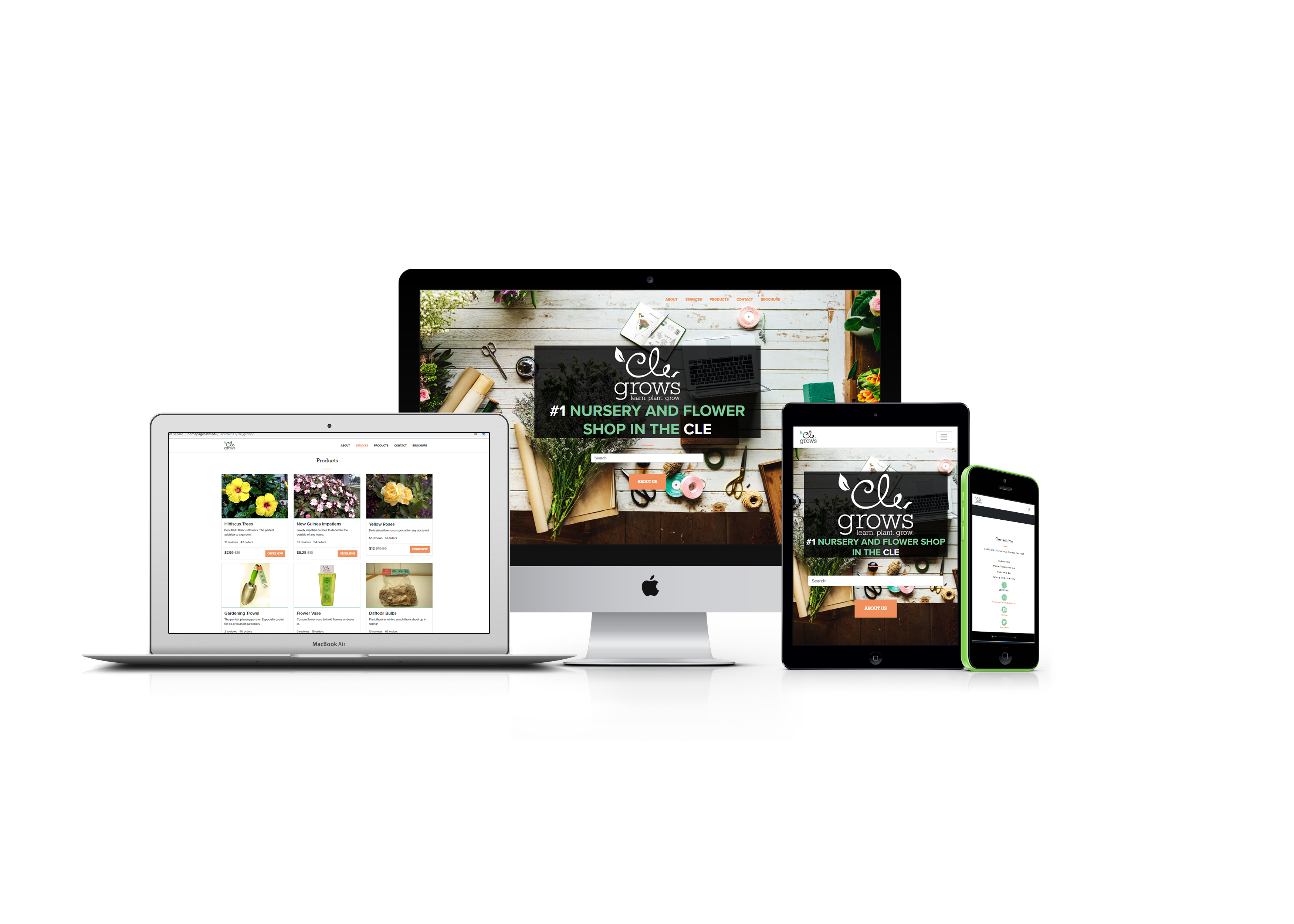


A local Cleveland business centered in the heart of Ohio City. Cle Grows specializes in flowers, gardening tools and gardening classes.
Cle Grows wanted to expand the business onto an e-commerce platform. In order to do that, I had to develop a website design consistent with the brand identity I established, while also taking their members, products, and services into account.
I created a colorful theme that was inspired by nature to create a consistent brand identity across all channels of Cle Grows. I used bootstrap to create a mobile friendly website to help Cle Grows sell products to online customers. I also placed photos of the product into an e-commerce code snippet for consumer viewing.
More people are looking at the Richey-Barrett Co. social media and website. The company has been reaching more people through social media. More of Richey-Barrett’s followers are becoming engaged via digital resources The engagement helps drive a better understand of the company and the services the company offers to clients.
A local Cleveland business centered in the heart of Ohio City. Cle Grows specializes in flowers, gardening tools and gardening classes. Copywriters: Alaina Battle Rebecca Cartwright Rachel Rakosy
The task was to develop a brand identity that was consistent with the image and motto that Cle Grow’s incorporates. My group was tasked with writing and using the same copy, and developing different designs for the copy.
I incorporated colors found in nature into the brochure - such as green and orange. I tried to incorporate the product that Cle Grows is known for - flowers and friendliness. I used photos that I took (front and back cover), and photos free for commercial use from pexels.com. The imagery and typography are used to represent the brand identity of Cle Grows. I also utilized the motto of “Learn, Plant, Grow,“ throughout the booklet in relevant areas.

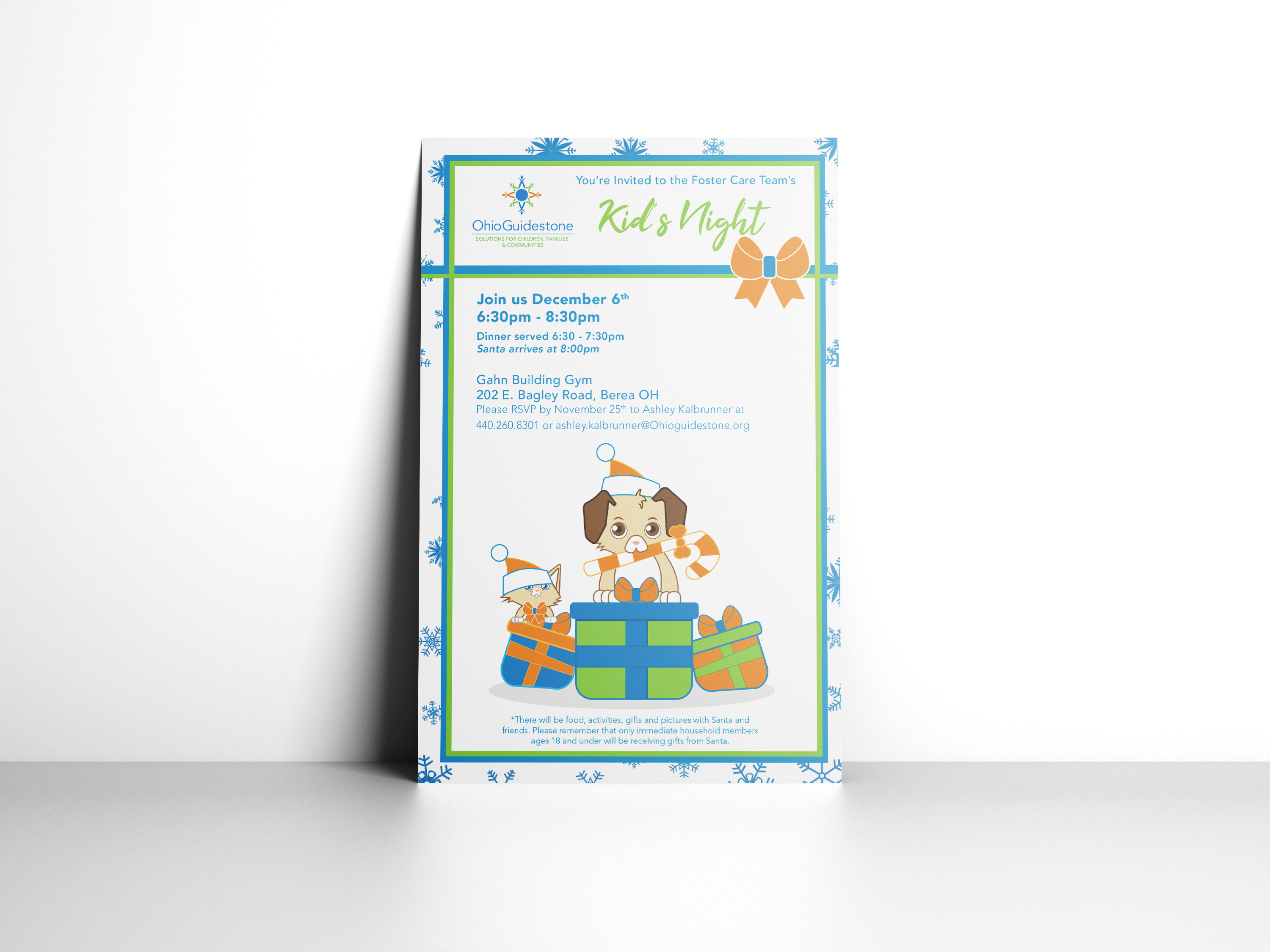
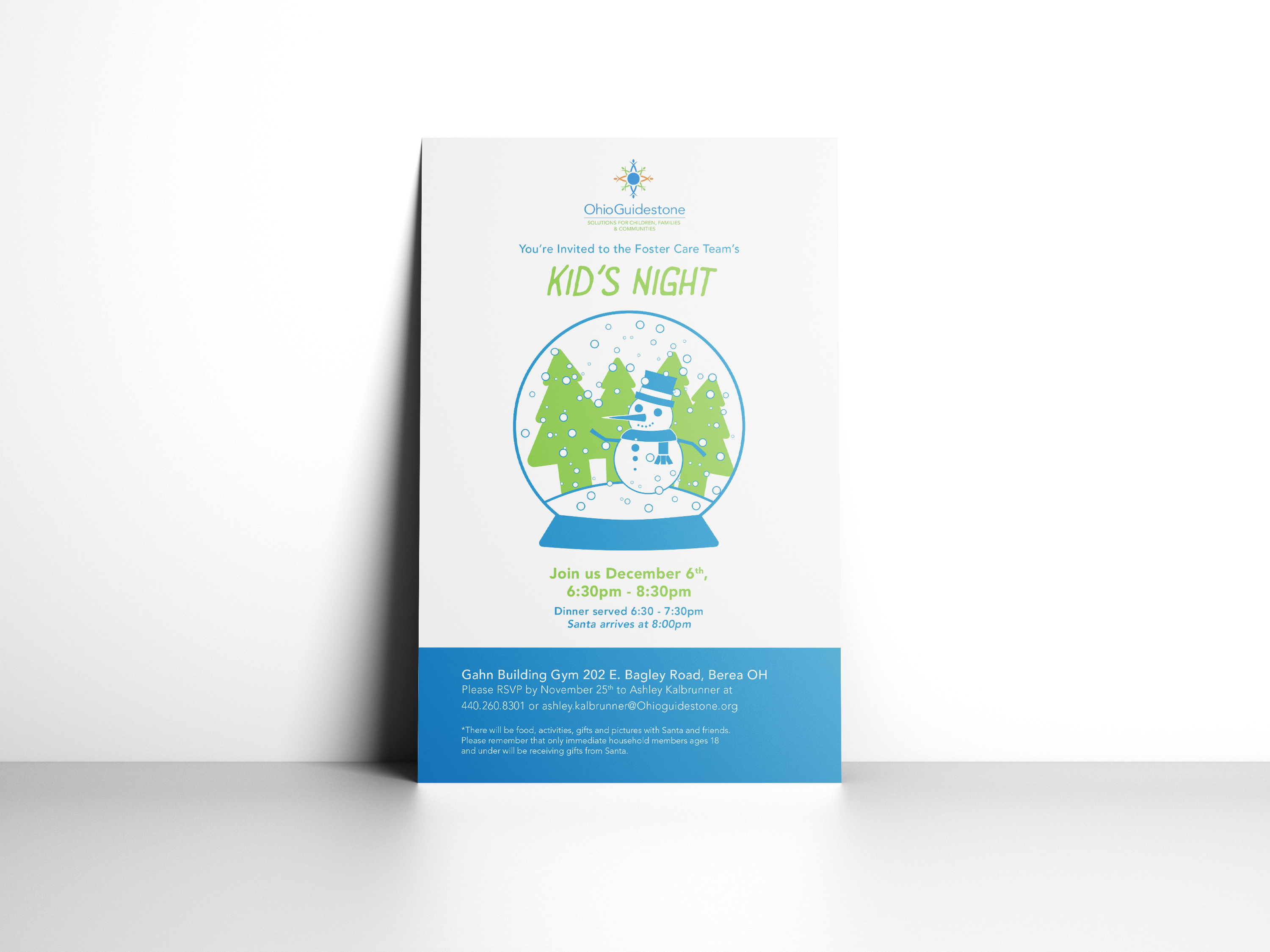
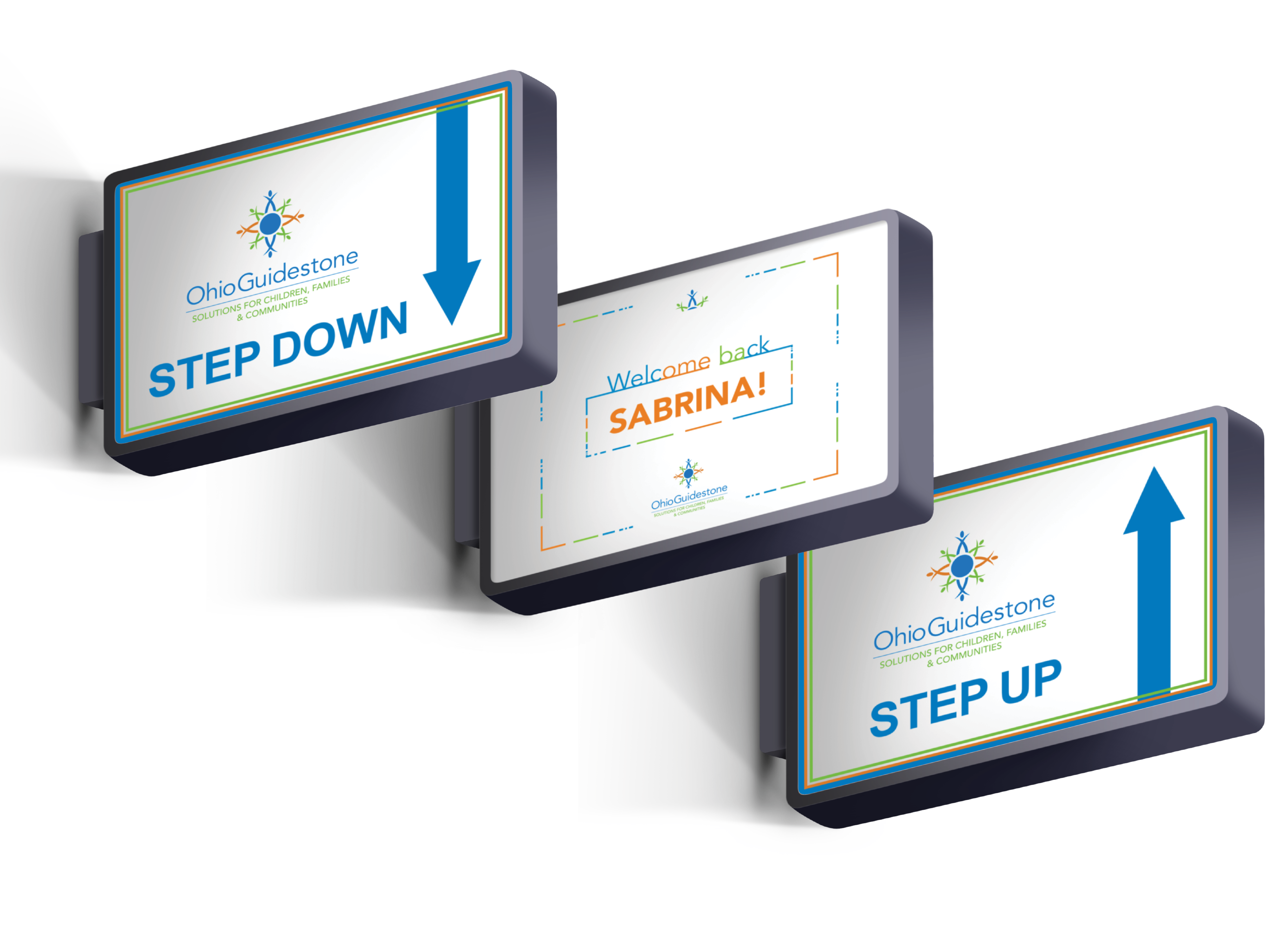
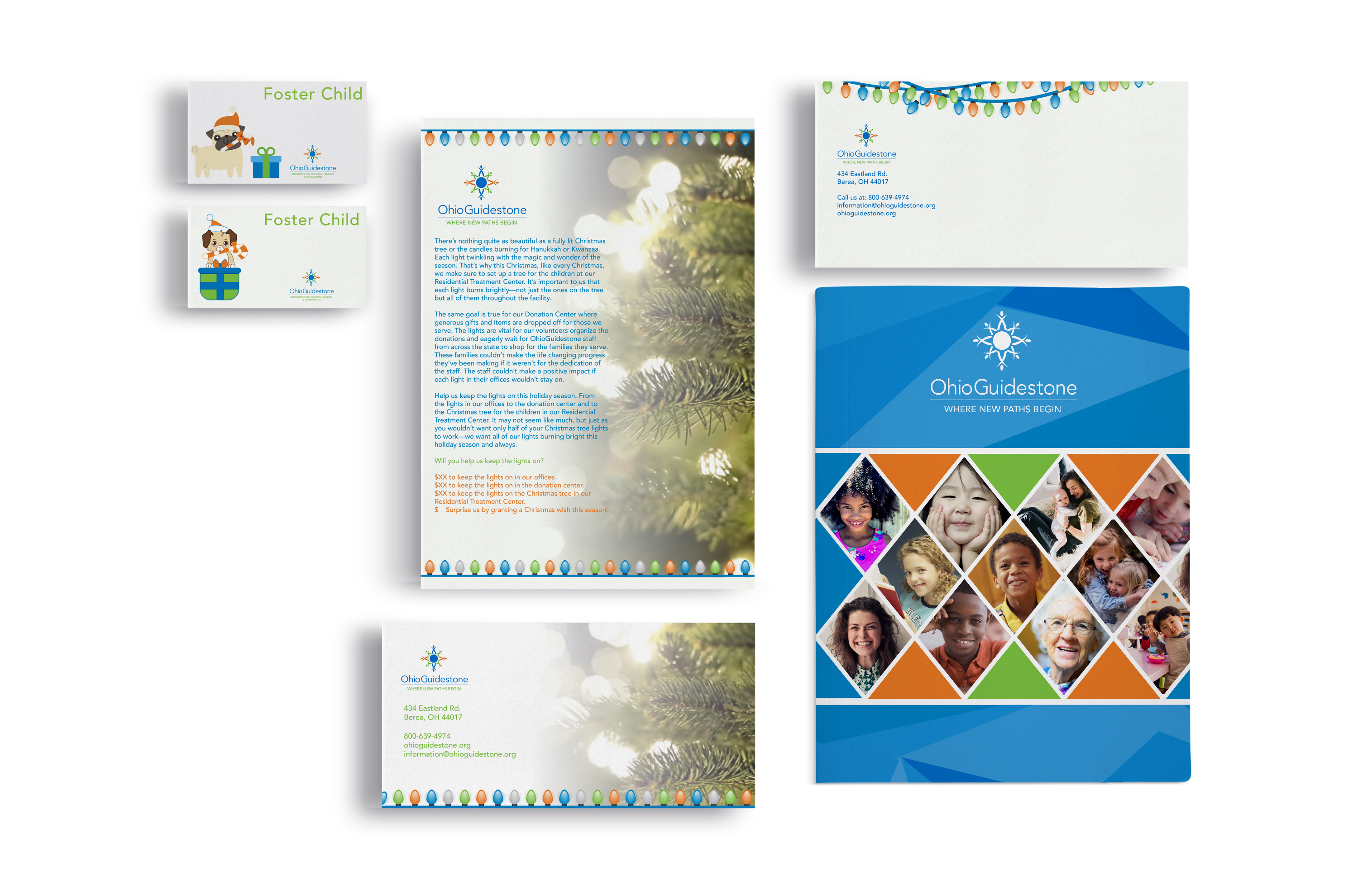

(Internship) Graphic Design / Communications Internship Ohio Guidestone is a non-profit organization located in Berea, Ohio. The organization is the largest behavioral health facility in the state of Ohio. They work with many people at any age from children to adults. They have done a lot of work in the community helping children, teens, and adults be successful in their lives. I was happy to intern at OhioGuidestone because it is a great organization that helps many people who have fallen victim to troubling times.
During my internship at OhioGuidestone, I helped the communications team design various print and digital media assets during the fall of 2019. I designed in-house print materials, invitations, social media graphics, and signage for the organization. OhioGuidestone needed someone to assist them with editing and updating in house materials to be used at the company.
For the various projects I worked on during my internship, I used Photoshop, Illustrator, and InDesign to create or edit in house materials for the organization. For time-sensitive social media graphics, I used Canva or graphics that were created by the communications department. I edited text documents for the communications team.

Richey-Barrett Insurance Company is a local insurance agent based out of Westlake, Ohio. The company provides clients with a wide range of insurance services such as auto, home, small business, life, and church insurance for Ohioans. Digital Marketing Clinic Team for Richey-Barrett: Rebecca Cartwright (Digital Marketing Specialist, & Graphic Designer) Bri Curran (Digital Marketing Specialist & Account Manager) Brandyn Graham (Digital Marketing Specialist & Web Developer) Lexus Lander (Digital Marketing Specialist & Content Writer) Tim Marshall (Digital Marketing Clinic Program Director)
Richey-Barrett Co. has been having a difficult time attracting younger customers. The president and vice president of Richey-Barrett Co., Mr. Jeff Gisser and John Bouhall, commissioned the Digital Marketing Clinic of Baldwin Wallace University to help jump-start a digital marketing campaign.
The Digital Marketing team has helped Richey-Barrett organize its brand identity across medias such as websites, blog posts, and social media accounts. Our goal was to provide Richey-Barrett with more relevant content, such as blog posts, infographics, and designs they can use to engage potential clients. I was tasked with creating a logo to be used across digital platforms and infographics to help clarify the differences between specific insurances the company offers. The infographics provided clarity for viewers and prospective buyers.
More people are looking at the Richey-Barrett Co. social media and website. The company has been reaching more people through social media. More of Richey-Barrett’s followers are becoming engaged via digital resources The engagement helps drive a better understand of the company and the services the company offers to clients.
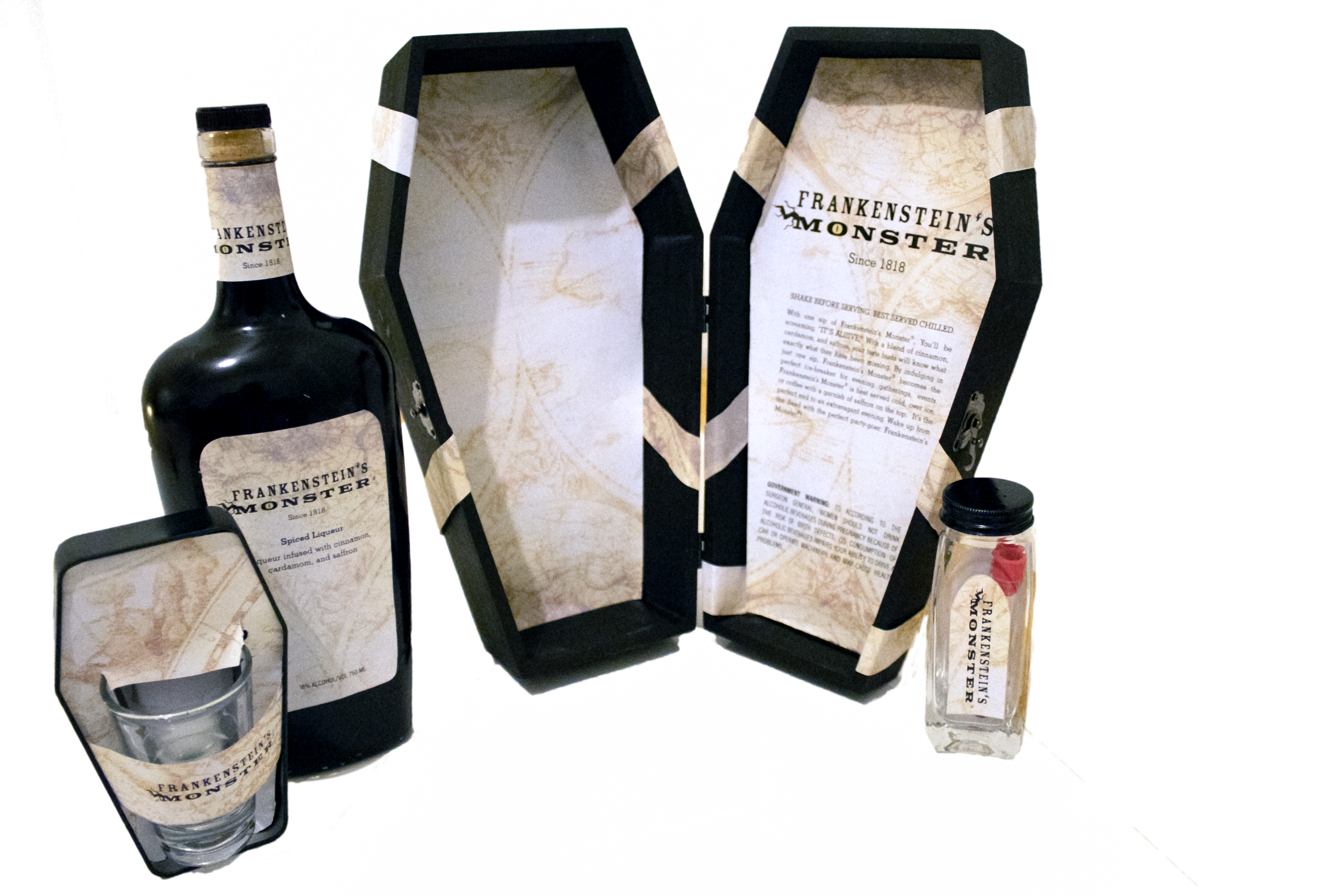
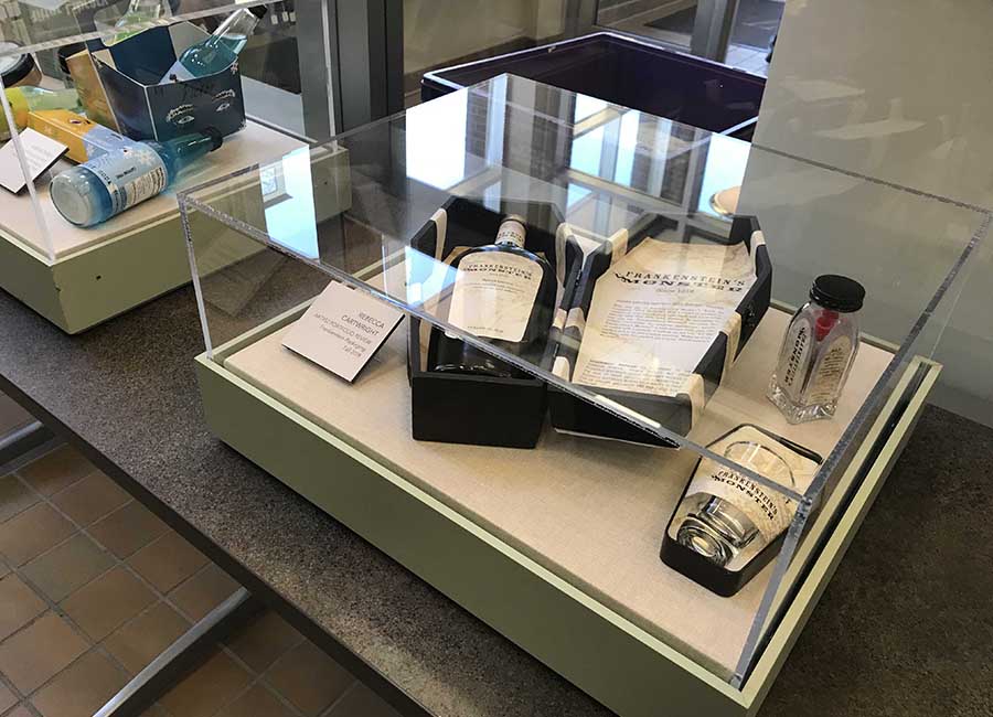
The 200th anniversary of Mary Shelley’s Frankenstein “Frankenstein’s Monster” was invented to celebrate the 200th anniversary of Mary Shelley’s “Frankenstein“. Baldwin Wallace displayed Frankenstein-themed works throughout Ritter library to showcase the work of students across different majors. In fall of 2018, Mary Shelley’s Frankenstein became 200 years old. To celebrate, Baldwin Wallace University dedicated the library to all things Frankenstein from September 2018 - December 2018.
Design relevant packaging that looks like it would fit into the Frankenstein movies or books. The packaging was presented to Ritter library to showcase the works of the graphic design department.
I created packaging that was consistent with the theme of Frankenstein. Frankenstein’s Monster is a liquor that looks as if Dr. Frankenstein invented it himself. The yellowed paper of the map represents the aging paper of a book. The coffin-shaped objects are representative of the life, death, and reanimation of Victor Frankenstein’s monster.
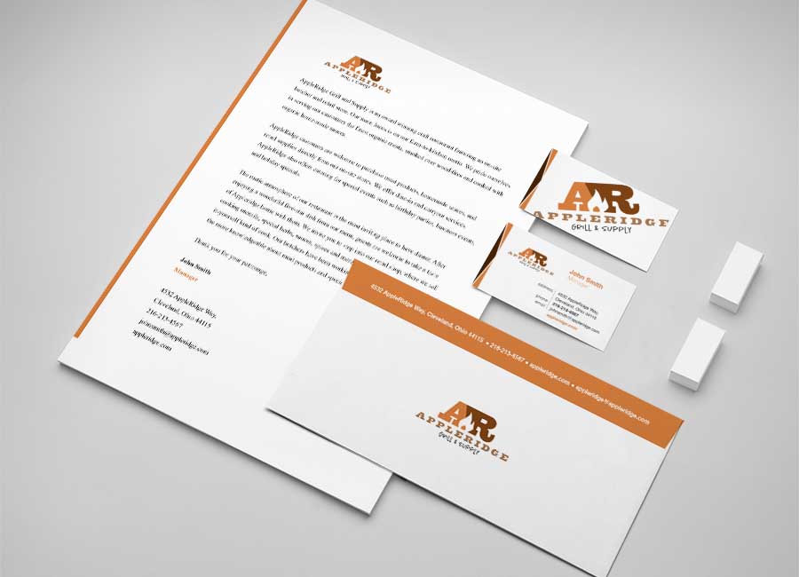
AppleRidge Supply and Grill is a farm-to-table restaurant & butcher shop. The restaurant specializes in fresh-cut meats, steaks, and an on-site butcher that provides classes to the community. AppleRidge targets middle and upper level customers.
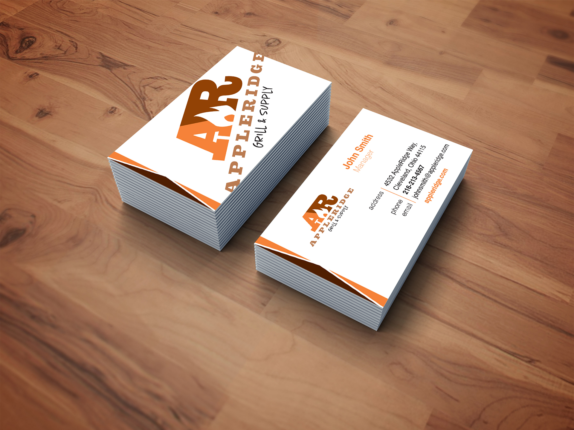
As a start up business, AppleRidge Supply & Grill did not have any branding or marketing in place that would help customers become familiar with the company. AppleRidge needed consistent branding across business cards, letter heads, mailing materials, and other business materials to help establish an identity.
I created appropriate branding relevant to the company. I researched restaurants similar to AppleRidge and combined what I learned from the research to create a relevant brand identity for AppleRidge Supply and Grill. The logo is representative of AppleRidge’s farm-to-table motto. The stationary is consistent with AppleRidge’s brand standards. AppleRidge’s identity is consistent throughout the stationary. The slab-serif font represents a western style that AppleRidge incorporates in the restaurant facilities. The colors are similar too the meat and spice products that the restaurant sells in the on-site stores.
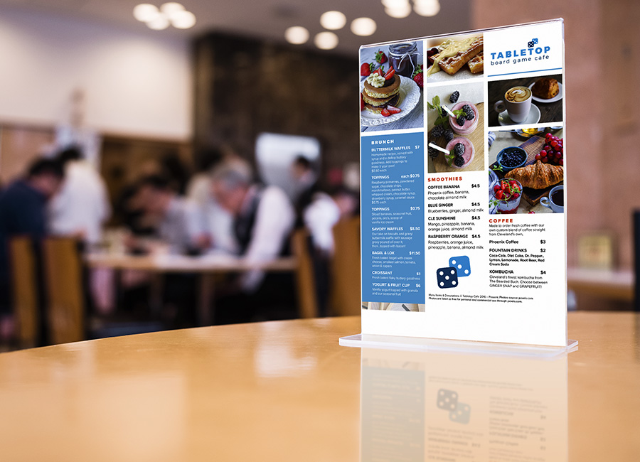
Tabletop Board Game Café Tabletop is a board game café located in Ohio City, (Cleveland) Ohio. They specialize in breakfast and brunch items. Guests can play board games while they wait for their food to be served. Tabletop has special events and gaming sessions open to players of all experience levels.
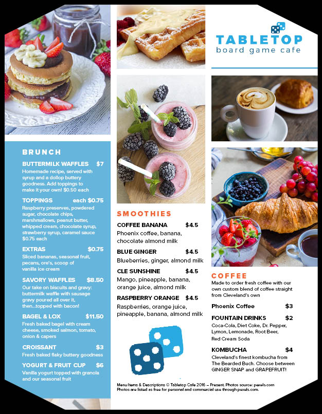
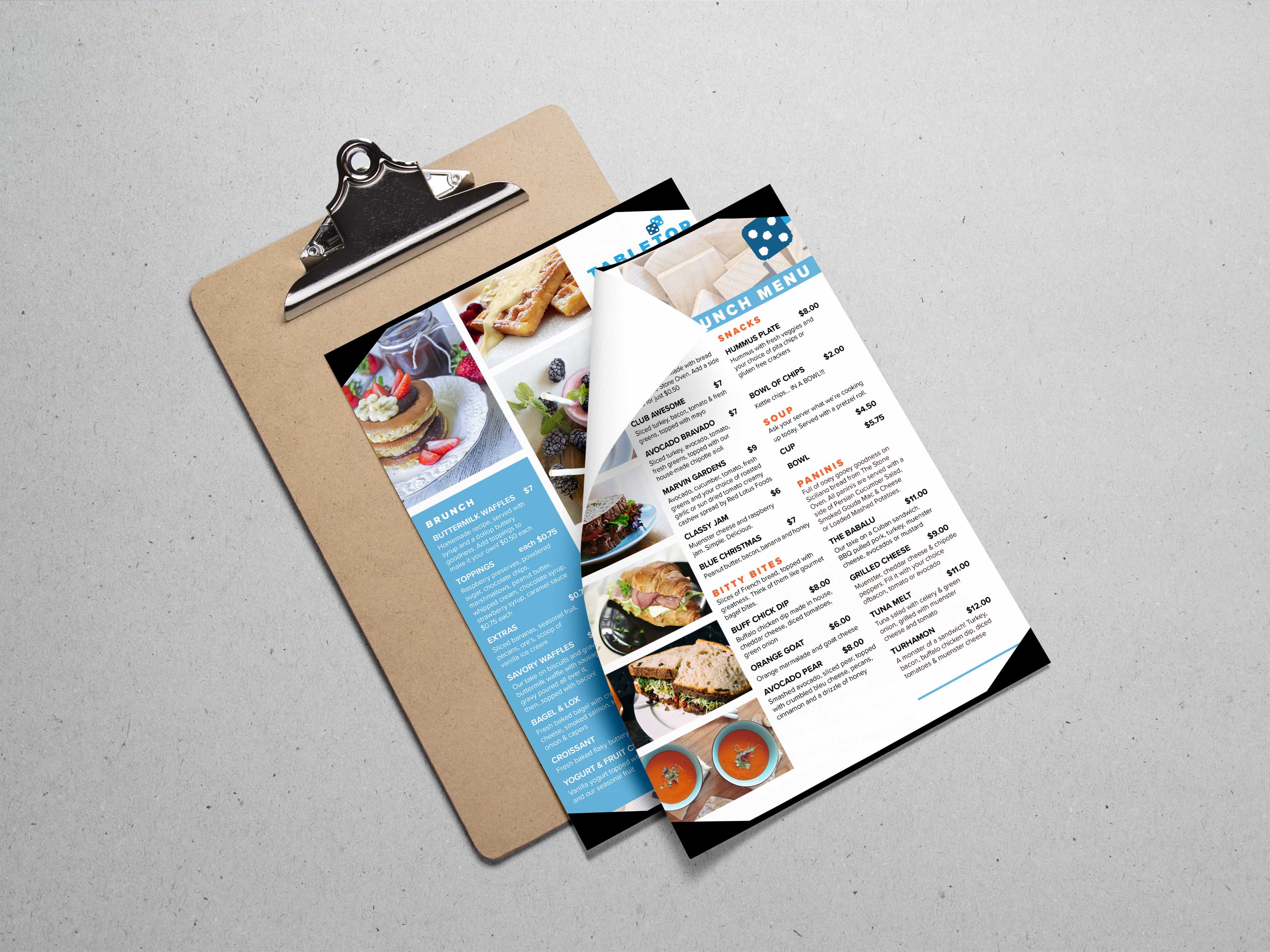
Tabletop was in need of re-branding their menu items to make them appear more clear, appetizing, and appealing to their customers.
I used visual hierarchies to organize the menu into a clearly readable layout. Customers and guests are able to find what they are looking for easily. This helps to reduce the time spent reading the menu. The photos invite the customer into trying the item pictured on the menu. I added dice to the logo as a play on the name “Tabletop,“ to make it appear as if they are sitting on top of a table (represented by the letter “T”). The color blue was used to represent the relaxed, friendly, and inviting atmosphere of “Tabletop: board game cafe.“
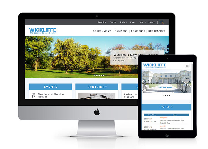
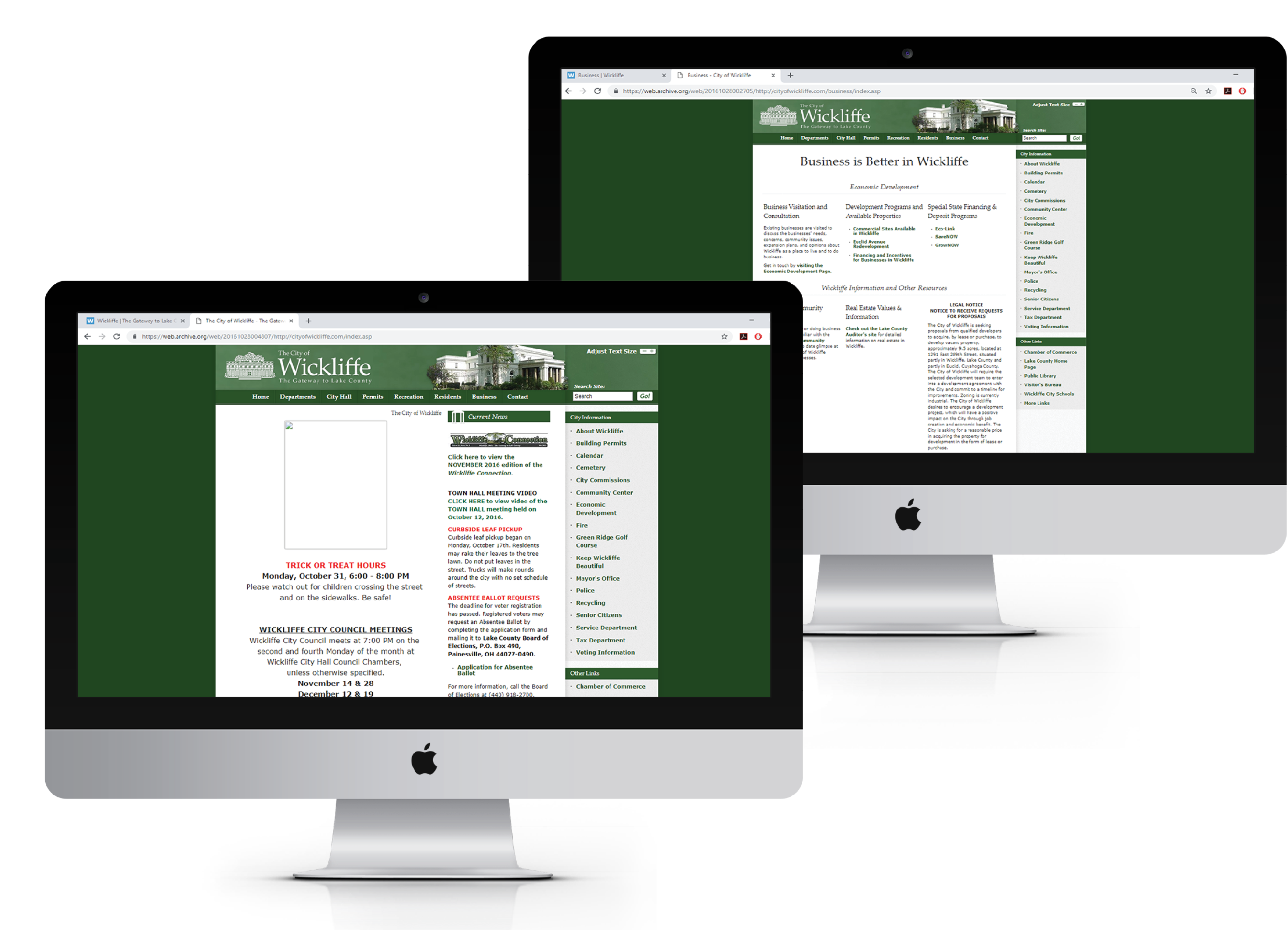

The City of Wickliffe is a city located in Lake County, Ohio with a population of 12,736. In 2017, Mr. William A. Margalis served as mayor for the city. Mayor Margalis worked closely with students in the Visual Communications: Web and Interactive Media program at Cuyahoga Community College to create and compile a modern working website for the residents of Wickliffe, Ohio.
Desmond Carter (Game & Web Developer)
Rebecca Cartwright (Graphic Designer & Web Developer)
Geno King (Game & Web Developer)
Kevin Mansfield (Lead Designer & Web Developer)
Dwight McKenzie (Web Developer)
Sara Morgenstein (Assistant Professor of Visual
Communications Program: Interactive Media & Web Design)
Hallie Stephanik (Photography & Web Developer)
The website was very outdated and used an older template that was designed in 2008. Residents of Wickliffe faced complications when using the website on mobile devices because it was not mobile-friendly. The mayor’s assistant, Ms. Patricia Fowler, also faced difficulties when trying to update the site, as she would have to change the HTML/CSS with every update. Residents and businesses had a hard time searching for and locating information on the site because it was very disorganized. The Visual Communications group was tasked with redesigning, reorganizing, and reimplementing a user-friendly site.
The Visual Communications team utilized resources such as Bootstrap, WordPress, HTML/CSS, and PHP libraries. The team created an initial website design and imported Bootstrap into our design. Bootstrap helped to make the initial design mobile friendly for users who access the website via cellphone, tablet, or any other mobile device, by adjusting for appropriate screen sizes. The team replaced the city’s content management system with WordPress: an easier to use, easier to manage content management system. WordPress allowed for easier updates and changes to the site.
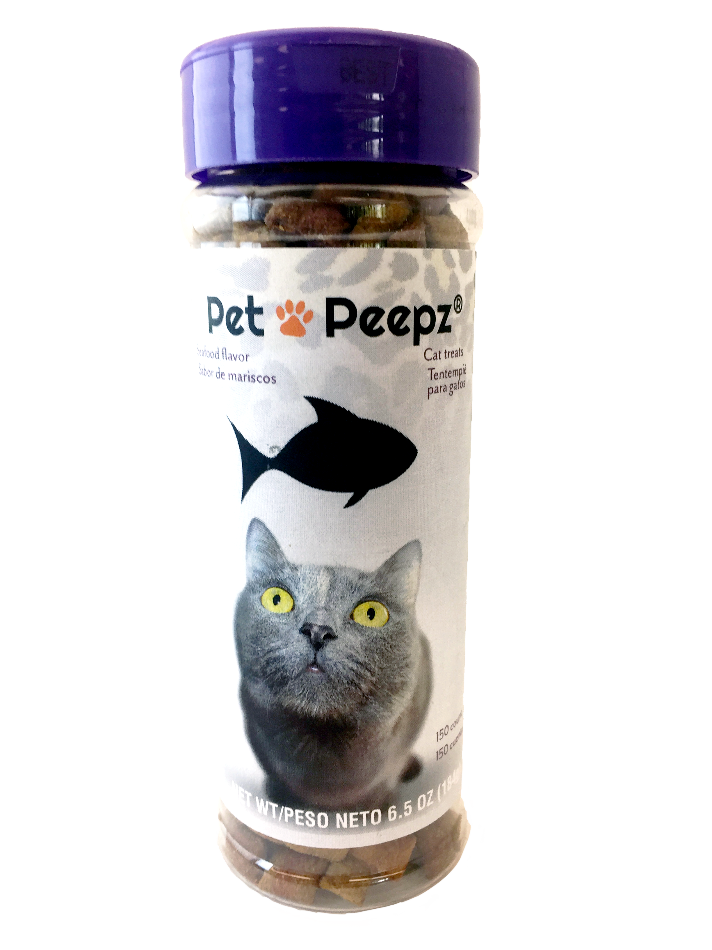
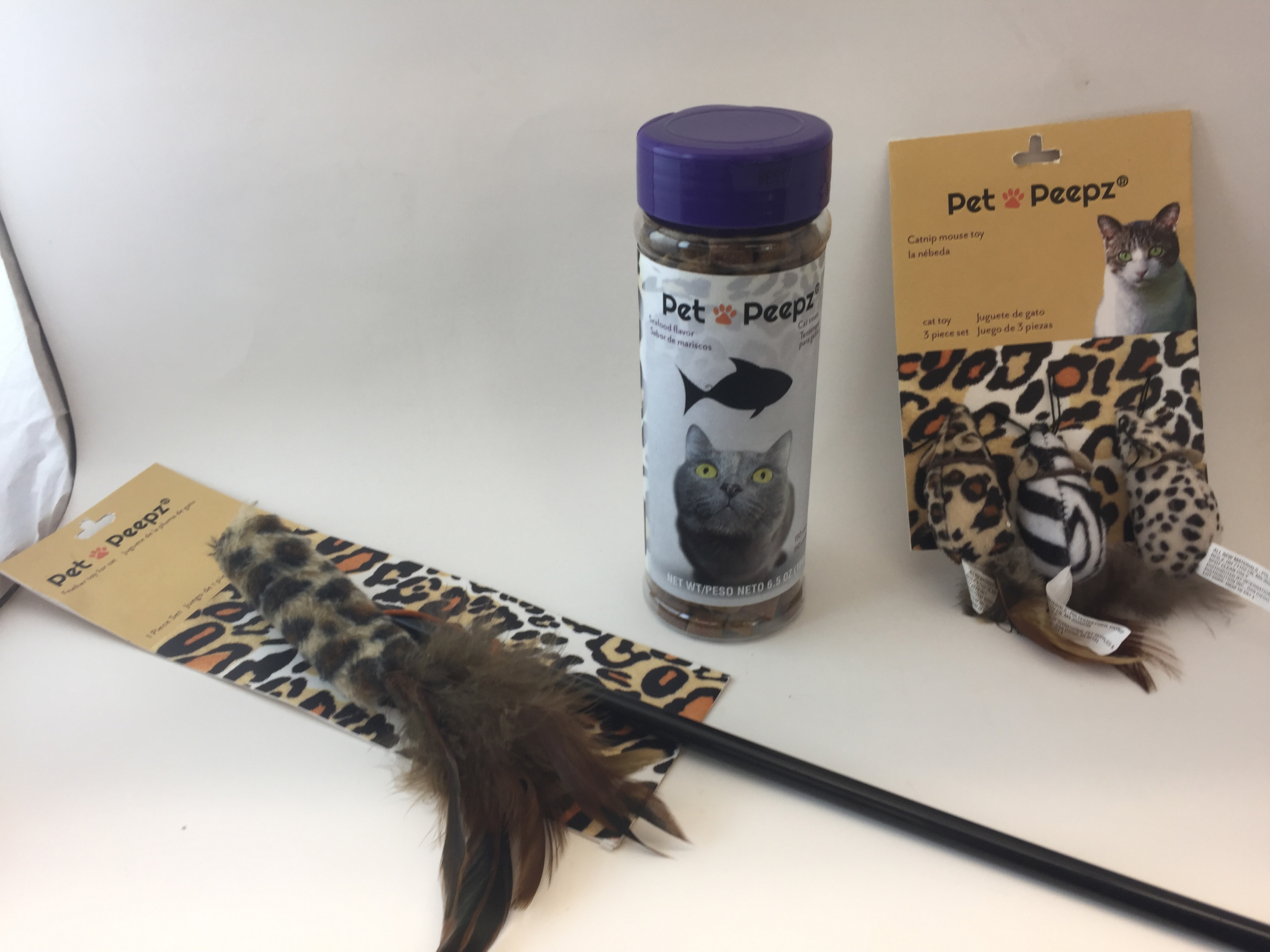
Pet Peepz offers a variety of products to customers. Products range from a wide selection of products for cats, dogs and other various household pets. Their products include toys, treats, food, and accessory items for pets.
Pet Peepz needed appropriate and interesting packing for their customers. They needed to attract customers in order to buy their product. They also needed to sell to specific customers based upon the pet they had and the needs of the customer and pet.
I created packaging for each product based upon specifications of product. The packaging had to contain the product and also contain relevant information about the product. I chose to use elements associated with cats to appeal to cat owners.

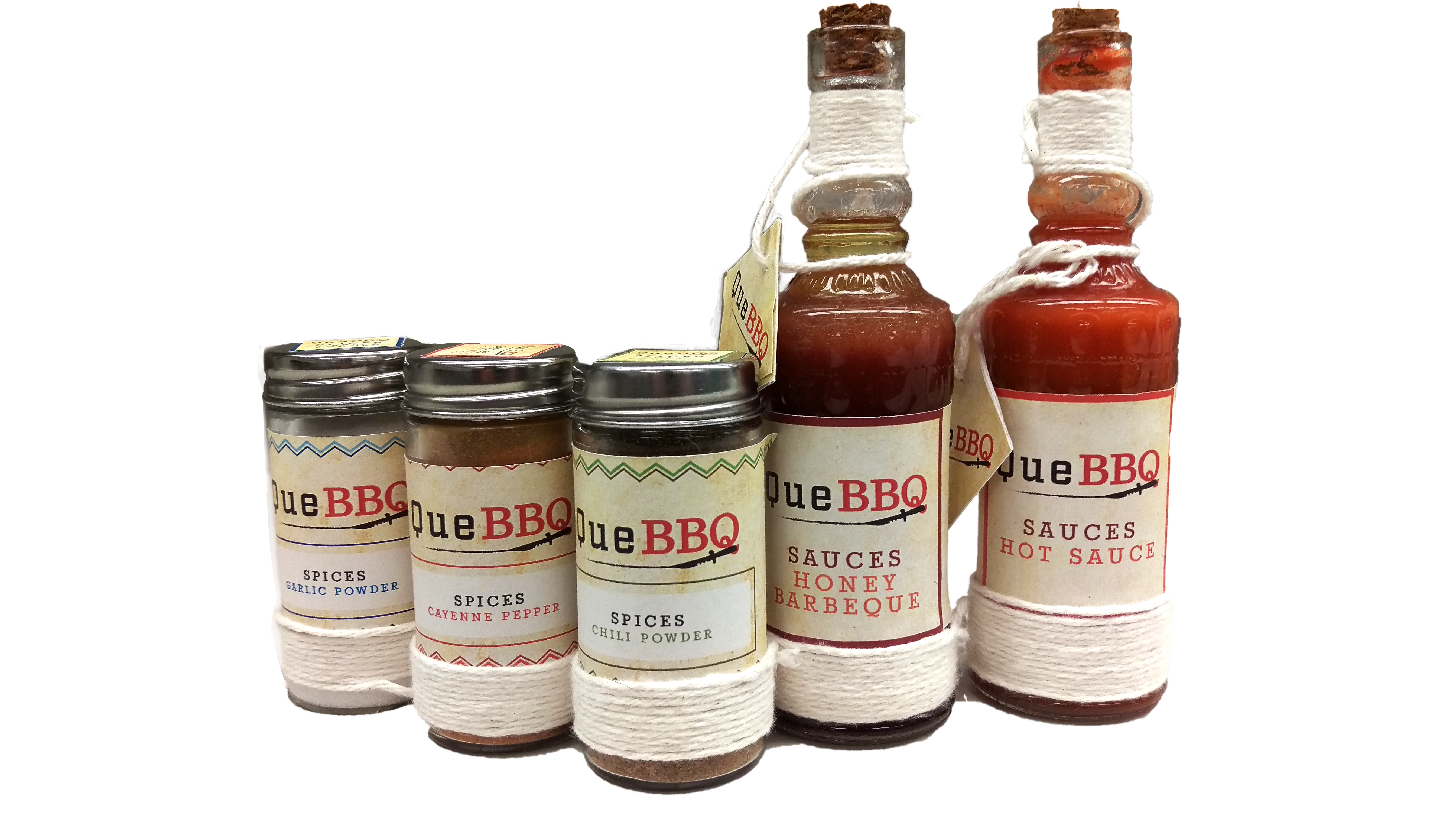
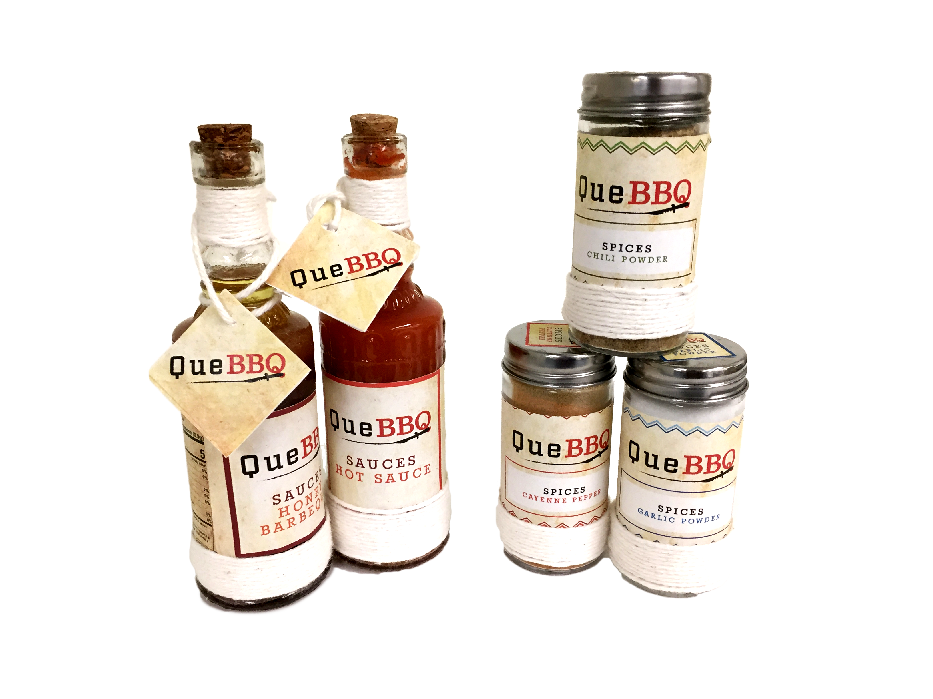
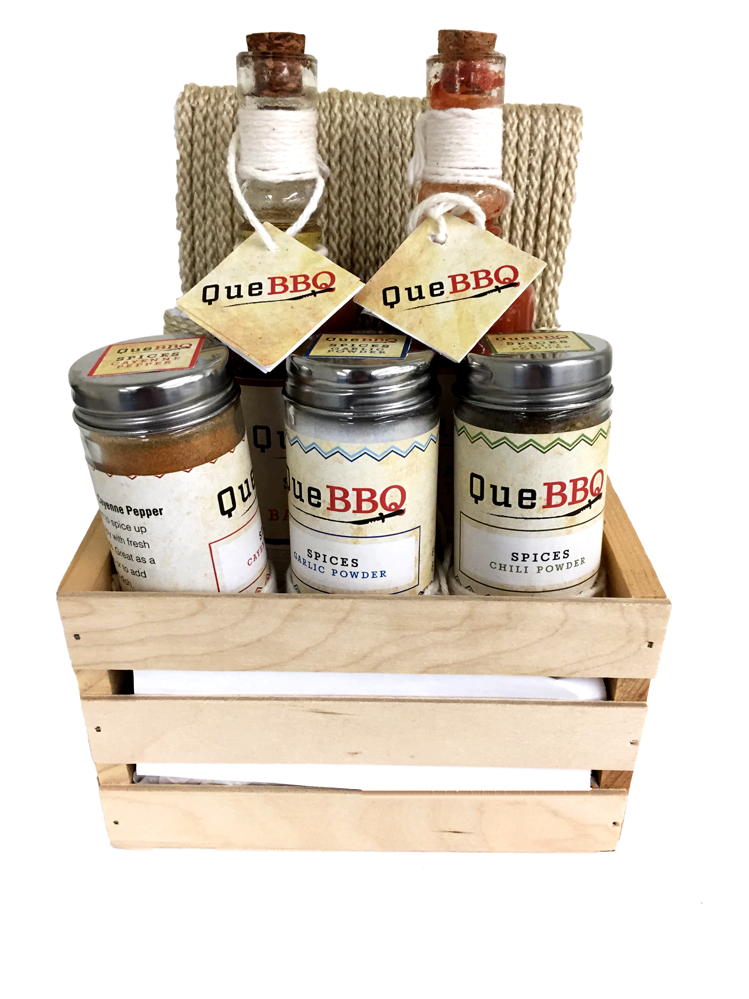
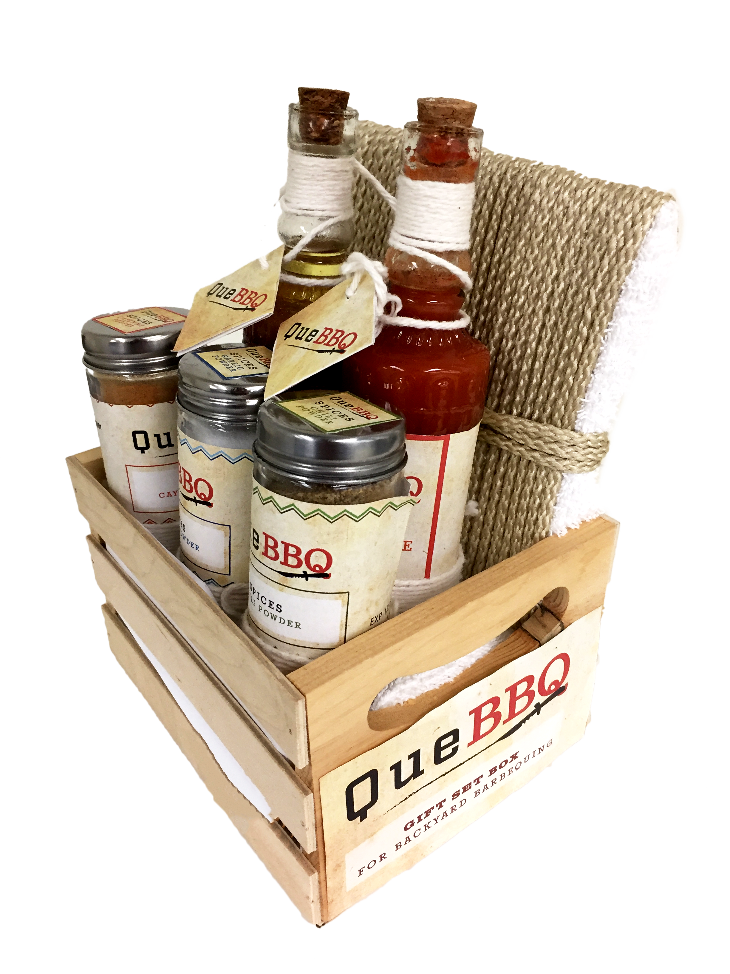
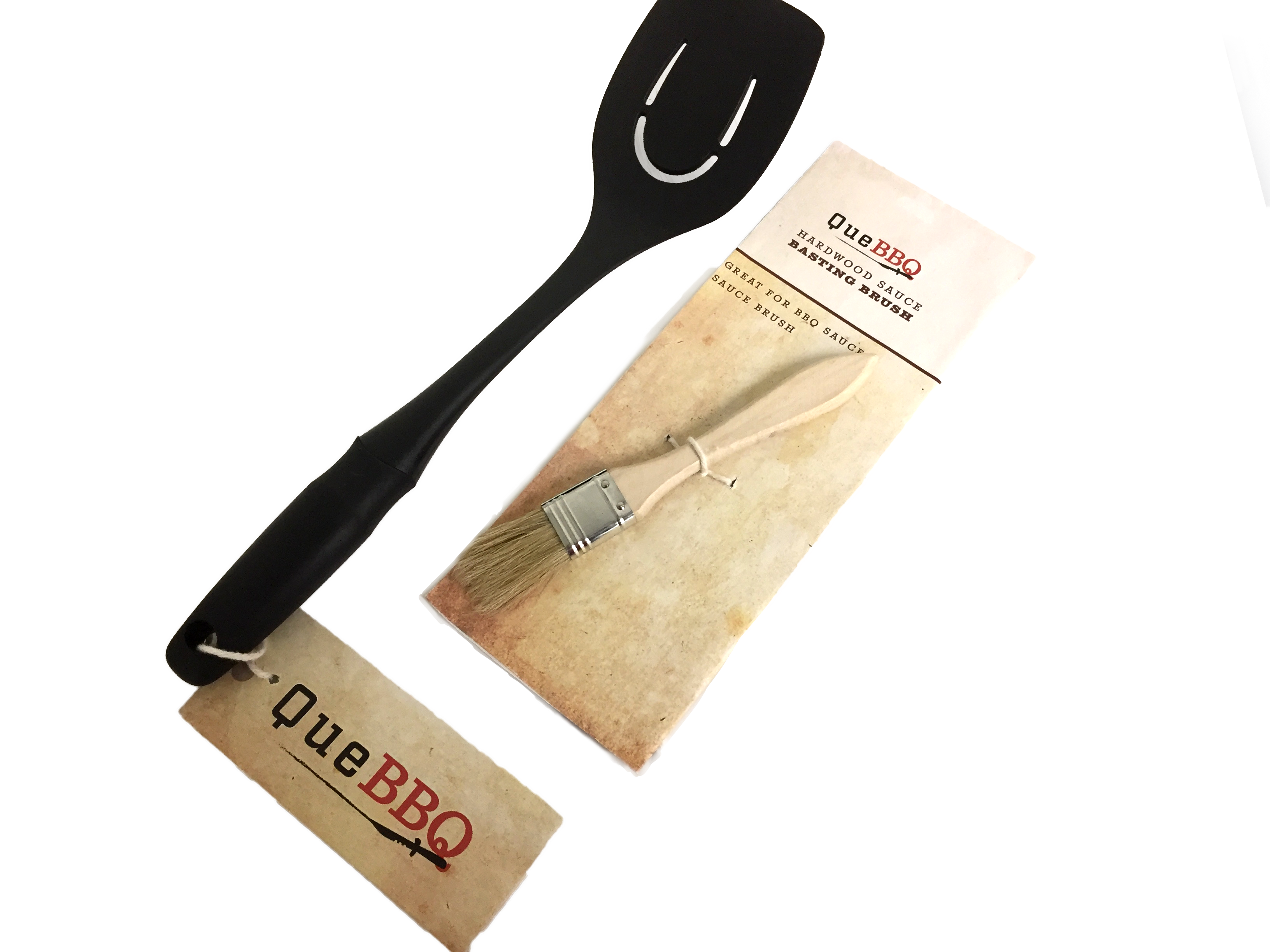
Que BBQ is a company that offers a wide variety of culinary equipment from culinary utensils to sauces and spices. They will help get your backyard BBQ going.
I was challenged with creating consistent packaging and branding for the company packaged into one complete gift set.
I created packaging for each product based upon specifications of product. The packaging had to contain the product and also contain relevant information about the product. I made products look like a set in order to create a brand identity for the product and consistency. Guidelines for the packaging had to be followed as well. These guidelines involved the inclusion of the declaration of product, ingredients list, the declaration of responsibility and the company name, location, and contact information.